Drinking Your Own Champagne
| 23 January 2017 | Tweet |
Performance Debugging as Exploratory Visual Analysis
By CC Kanne, Workday, San Mateo
Debugging production performance issues in distributed systems is rarely easy. A large number of factors influence system behavior. Controlling all of them to get deterministic, comparable results is usually impossible. Also, any attempt at getting even a partially controlled environment is invasive for the customer: They need to spend time helping with experiment setup, and/or limit system access to control workloads. The “controlled study” approach is not very attractive from a customer’s point of view. It usually takes quite a long time to execute, as well.
In modern distributed systems, a lot of operational data is collected. With the right tools, you can look at all that data instead of examining individual log excerpts. Instead of a controlled experiment, we perform an “observational study” where the various performance- affecting factors are controlled during analysis, by fine-tuning filters and aggregation levels. Essentially, we assume that our data already contains information about requests that are similar to the ones you would want to run in an experiment. You just need to find them.
Generic performance analysis tools usually are good at one of two extreme grains: Low-level analysis of specific runs (e.g. profilers, log file inspection with ad-hoc scripts and spreadsheets), or monitoring of predefined, coarsely aggregated metrics (for dashboarding). Even with tools, the former is typically slow and costly (in terms of developer time). The latter is primarily useful for detecting sweeping problems that affect the entire system, or for previously known types of issues that have predefined metrics. The type of debugging we propose here would require a different type of tool. Unexpectedly, we found we already had such a tool available.
A war story
Our team (formerly Platfora, recently acquired by Workday Inc) is focused on building an analytics platform that gives business users and analysts direct access to their data. Part of this analytics tool is an in-browser data visualization tool backed by a custom, distributed data processing system. In one particular case, a customer opened a support ticket insisting that some visualization workbooks suddenly spent much longer in backend query processing than what their analysts were used to from earlier experience. Not all queries and users were affected. In addition, not every individual user who experienced a performance drop would have reported this, so we did not have a precise starting point of the problems. However, the problems seemed to clear up for a while after every system restart.
Unfortunately, the phenomenon did not reproduce easily. There was no smoking gun, such as two runs of an identical query with two different runtimes. A big use case for our tools is interactive data exploration, so queries change frequently, making “longitudinal” observations about the performance of the same query over time difficult (the same query may not re-occur often enough).
The usual suspects appeared innocent:
- no changes in overall workload
- independent benchmarks showed consistent hardware performance (CPU, network etc)
- the logs of this particular system showed that JVM garbage collection activity was low and stable over time
- the relevant data caches did not show increased miss ratios
Too much back and forth and experimentation would have been a waste of the customer’s time, so we decided to rely purely on analysis of system telemetry data until we could identify a good candidate explanation. (The customer opted-in to share this data with us). Our servers produce fairly detailed instrumentation traces (at a rate of a few dozen GBs/day for the 18-node deployment under investigation here). This feature was originally intended to be able to look at the precise performance breakdown of individual queries (one example of a fine-grained analysis tool mentioned above).
In this case, we did not have a single query we wanted to investigate – we needed a way to discover criteria for what “slow query” really means. Digging through the individual traces of tens of thousands of queries was not a cost-effective way of making progress. Using spreadsheets to aggregate and visualize the data would not scale to the volume of trace data we had (several Terabyte).
Drinking Your Own Champagne
We recognized that we had an instance of a big data exploration problem at our hands – exactly the type of problem our tool is designed to attack, only that we usually target business data and not debug logs.
We pointed our server at the trace log, and defined some data preparation rules about which trace entries with data volume information relate to which trace entries with CPU time information. The entire process took less than half an hour – less than what you’d need to write simple custom shell scripts for log parsing. Our system converts that input data into a memory representation that our query engine and visualization layer can turn into interactive visualizations.
We now looked at the aggregate performance of the different operators in our query execution plans across many queries. One of the most computationally intensive operators is the merge operator that combines results from the different worker nodes into a final result. Below is a scatterplot of merge times, with each dot aggregating all merge events for one query. The number of processed rows is shown on the x-axis, and used CPU time the y-axis.

Visually, it is easy to make out that there is a clear distribution around at least two different processing rates (each is one diagonal cluster). We tried to explain the different rates by features of the query, but it turned out that only one feature was really important – query width. In the chart above this is represented by color – the darker the query dot in the scatterplot, the more group-by columns are used. For a given query width (color), there still are two diagonals. Note the logarithmic scale – one is more than an order of magnitude slower than the other. The customer was right, something fishy was going on! It only stood out for some of the longer running queries, but now we had a much clearer target.
To make results less fuzzy, we looked only at wide queries (more than 10 group-by columns), and found to our surprise that we needed no other variable to explain the different rates other than the time since server restart. In the following chart, we switched to showing the CPU time/merged row in the y-Axis, and show “time since server restart” for a few server lifetimes.
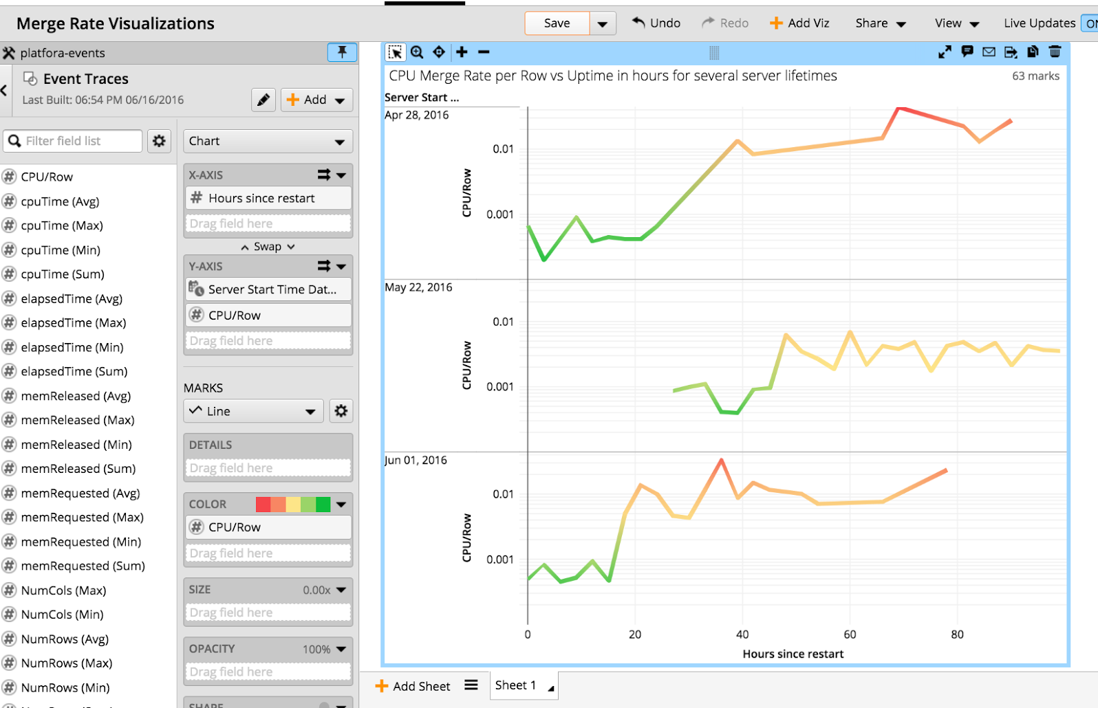
Merging slowed down without recovery after some uptime. We found a similar behavior when performing the same analysis for the sort operator. Interestingly, sorting performance became worse at a different point in time than merging performance. So different parts of the code were affected at different times, and only on certain nodes. Given the other bits of data we had collected, this pointed to the Java runtime becoming worse at executing our code. After memory management, the most important performance-influencing factor is the Java just-in-time (JIT) compiler. From there, we quickly determined that our Java JIT code cache capacity was exhausted after some fraction of the code had been compiled. Surprisingly, in Java 1.7 this effectively leads to a gradual shutdown of compiled execution and a fallback to interpretation – exactly the progressive slowdown that we observed. A simple configuration change to increase JIT code cache size fixed this behavior.
Let’s do that again!
We were able to resolve the customer problem quickly and with minimal customer involvement. This high-level, visual, and interactive style of performance analysis is very efficient and it gives us a better feeling of progress than the “staring at logs and static numbers” style. Last but not least, it is very rewarding for us as engineers to use our own product to answer our own real questions, instead of using the product just for testing. For us, this style of analysis really has become a popular item in the toolbox.
Author: CC Kanne. CC Kanne is an architect with the Workday Analytics Team. He has several decades of experience researching and implementing large-scale distributed query processing systems, query languages, and visual data analysis systems.